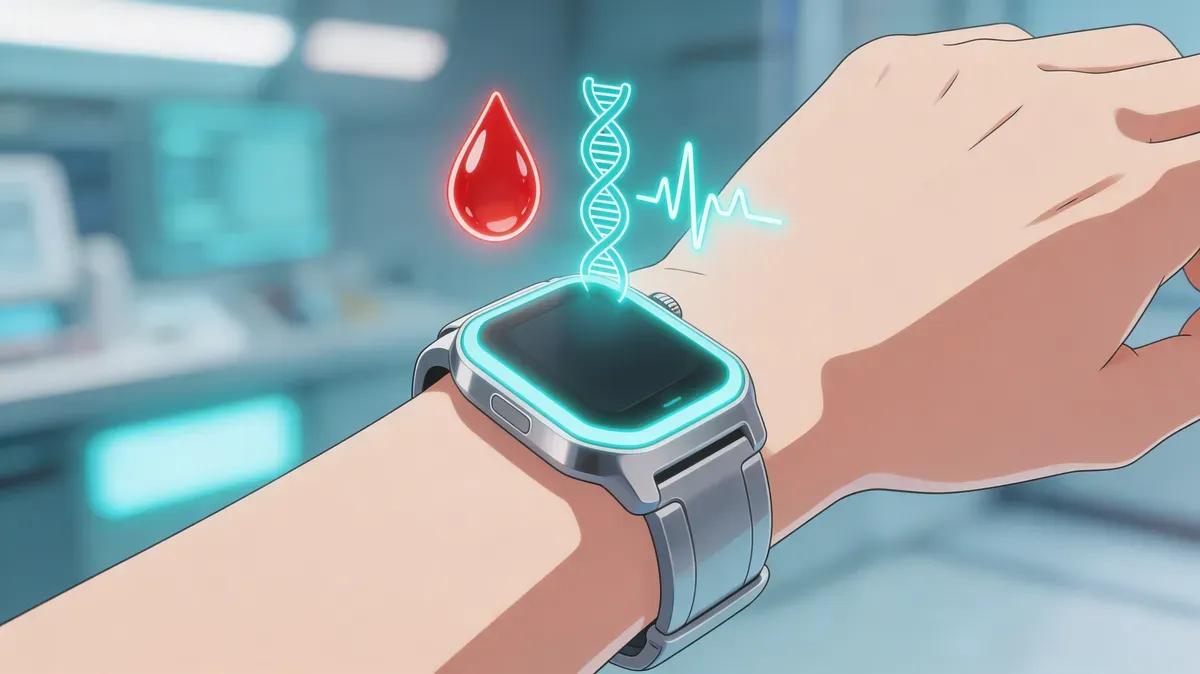
How to build a personal health dashboard with wearables, blood tests, and lifestyle data
Learn how to combine wearable metrics, blood test results, and lifestyle habits into one health dashboard that gives you a complete picture of your wellbeing.
Your Apple Watch collects over 300 data points per day. Your annual blood panel measures 20–60 biomarkers. You probably also track your diet, exercise, or sleep habits in at least one app. Yet most people look at each data source in isolation — missing the connections that actually matter.
A personal health dashboard changes that. Instead of checking five different apps and wondering what your numbers mean, you get a single view that shows how your wearable data, lab results, and daily habits interact. When your HRV drops, you can see whether it coincides with poor sleep, a stressful week, or a biomarker trending in the wrong direction.
This guide walks you through building a practical health dashboard — what to track, how to combine data sources, and how to turn raw numbers into decisions that improve your health.
What you’ll learn:
- Which wearable metrics, blood tests, and lifestyle data points actually matter
- How to organize and connect these data sources into a unified dashboard
- How to interpret cross-domain patterns and act on them
Why most people fail at health tracking
The average health-conscious person in 2026 uses 2.3 health apps. The problem isn’t lack of data — it’s fragmentation.
The real issue: Wearable apps show you trends in isolation. Lab portals display results without context. Habit trackers measure inputs without connecting them to outcomes.
Consider this scenario: your resting heart rate has been creeping up over three months. Your wearable app shows the trend but doesn’t explain why. Meanwhile, your latest blood panel shows rising hs-CRP (an inflammation marker) and declining vitamin D levels — both of which could explain the change. Without connecting these dots, you might blame poor fitness when the real culprit is systemic inflammation.
A personal health dashboard solves this by putting all three data layers — wearable metrics, biomarkers, and lifestyle inputs — in conversation with each other.
It is especially useful during life transitions, when the old baseline no longer applies. For example, a biological age after retirement dashboard should watch whether new freedom improves sleep and activity or quietly increases sitting, social isolation, and metabolic drift.
The three pillars of a complete health dashboard
Pillar 1: Wearable data (daily signals)
Your smartwatch or fitness tracker provides continuous, passive data. These are your leading indicators — they change in real time and can signal problems before you feel symptoms.
Core wearable metrics to track:
| Metric | What It Tells You | Frequency |
|---|---|---|
| HRV | Autonomic nervous system balance, recovery status | Nightly |
| Resting heart rate | Cardiovascular fitness, recovery, illness onset | Daily |
| Sleep stages | Recovery quality, cognitive health | Nightly |
| SpO2 | Blood oxygen, respiratory health | Nightly |
| Active calories | Energy expenditure, activity level | Daily |
| Steps | Movement volume, baseline activity | Daily |
| VO2 max estimate | Cardiorespiratory fitness | Weekly (updated with exercise) |
| Training readiness | Recovery vs training load balance | Daily |
How to read wearable trends:
Individual daily readings mean little. What matters is the trend over 7–30 days. A single night of low HRV tells you nothing; a two-week downward trend signals overtraining, chronic stress, or the onset of illness. Understanding wearable sleep tracking accuracy helps you calibrate how much weight to give individual sleep stage readings versus multi-night patterns.
Track your HRV trends as a 7-day rolling average rather than reacting to daily fluctuations. The same principle applies to resting heart rate and sleep efficiency.
Pillar 2: Blood biomarkers (quarterly snapshots)
Blood tests provide deep metabolic data that wearables cannot capture. They’re your lagging indicators — they change slowly but reveal systemic health shifts.
Essential biomarker panel for health tracking:
| Category | Biomarkers | What They Reveal |
|---|---|---|
| Inflammation | hs-CRP, NLR | Chronic inflammation, immune activation |
| Metabolic | Fasting glucose, HbA1c, fasting insulin | Blood sugar control, insulin resistance |
| Lipids | ApoB, triglycerides/HDL ratio | Cardiovascular risk |
| Kidney | Creatinine, BUN | Kidney function, hydration |
| Liver | GGT, AST/ALT | Liver health, alcohol impact |
| Nutrition | Vitamin D, B12, ferritin | Nutrient status |
| Aging | Albumin | Protein status, longevity marker |
Testing frequency:
For most healthy adults, a comprehensive blood panel every 3–6 months provides the right balance of data density and cost. For the complete reference — all 24 longevity biomarkers, optimal ranges, and what each predicts — see our complete blood work guide for longevity. Quarterly testing lets you see seasonal patterns and evaluate whether interventions (diet changes, new supplements, exercise programs) are working.
If you’re making a significant lifestyle change, consider testing before and 8–12 weeks after to measure the impact.
Pillar 3: Lifestyle inputs (behavioral context)
Lifestyle data provides the “why” behind changes in your wearable and blood data. Without this context, you’re guessing at causes.
Key lifestyle metrics to log:
- Nutrition: Daily calorie intake, macronutrient ratios, alcohol consumption, hydration
- Exercise: Workout type, duration, intensity, training load
- Stress: Subjective stress rating (1–10), work hours, major life events
- Sleep habits: Caffeine cutoff time, screen time before bed, bedroom temperature
- Supplements: What you take and when (for correlation with blood markers)
- Environment: Travel, altitude changes, seasonal transitions
You don’t need to track everything. Start with 2–3 lifestyle inputs you suspect influence your health most, then add more as patterns emerge.
Setting up your dashboard: a practical framework
Step 1: Choose your data sources
Start with what you already have. If you own an Apple Watch, your wearable data is already flowing into Apple Health. If you do annual blood work, request digital copies of your results.
Minimum viable dashboard:
- 1 wearable (Apple Watch, Oura Ring, or similar)
- 1 blood panel per quarter (basic metabolic + lipids + inflammation markers)
- 1 lifestyle input (the habit you most want to change)
Advanced dashboard:
- Apple Watch + Oura Ring (complementary wearable data)
- Quarterly comprehensive blood panel (30+ biomarkers)
- CGM (continuous glucose monitor) for 2-week metabolic snapshots
- Detailed nutrition and exercise logging
Step 2: Centralize your data
Apple Health serves as a natural hub for wearable data on iOS. Most devices and apps sync to it automatically. For blood tests, you’ll need to manually log results or use a platform that imports lab data. Before building your dashboard, it’s worth understanding how accurate Apple Watch health metrics are — which metrics to trust and where to apply context.
Data centralization options:
| Approach | Pros | Cons |
|---|---|---|
| Apple Health + spreadsheet | Free, full control | Manual blood test entry, no cross-analysis |
| Apple Health + health app (e.g., SuperAge) | Automated wearable import, biological age calculation | Blood data depends on app capabilities |
| Dedicated longevity platform | Full integration, AI analysis | Higher cost, data lock-in risk |
Step 3: Define your key metrics
Don’t track 50 metrics. Pick 5–8 “vital signs” that you check weekly, and a broader set you review monthly or quarterly.
Weekly dashboard (quick check):
- HRV 7-day trend (up, stable, down?)
- Average sleep score or deep sleep percentage
- Resting heart rate trend
- Weekly active calories or exercise minutes
- Subjective energy rating
Monthly dashboard (deeper review):
- All weekly metrics + 30-day trends
- VO2 max changes
- Weight and body composition trends
- Training load vs recovery balance
Quarterly dashboard (comprehensive review):
- All monthly metrics
- Blood biomarker trends compared to previous quarter
- Year-over-year comparisons for key markers
- Lifestyle intervention assessment (did the changes work?)
Step 4: Build cross-domain views
This is where the real value emerges. Create views that combine data from different pillars:
Example cross-domain analyses:
- HRV + hs-CRP: If HRV is declining and hs-CRP is rising, you have converging evidence of systemic stress or inflammation. Check your stress levels and sleep quality
- Sleep quality + fasting glucose: Poor deep sleep correlates with worse glucose regulation. Track both to find the connection — the mechanisms are explained in our metabolic health and aging guide
- VO2 max + hemoglobin + ferritin: If your VO2 max is dropping despite consistent training, low ferritin (iron stores) could be the bottleneck
- Resting heart rate + training load: A rising resting heart rate with increasing training volume is a classic overtraining signal
How to interpret your dashboard
Pattern recognition basics
Health data analysis isn’t about individual readings — it’s about patterns, correlations, and changes over time.
Three types of patterns to watch:
- Concordant signals: Multiple metrics pointing in the same direction. Example: declining HRV + rising resting heart rate + poor sleep = converging evidence of overtraining or illness
- Discordant signals: Metrics that should move together but don’t. Example: great sleep scores but declining HRV — may indicate a metabolic issue not captured by sleep alone
- Lagging confirmations: Blood markers that validate what wearable data suggested weeks earlier. Example: HRV declined for a month, then next blood panel shows elevated hs-CRP
When to take action
Not every fluctuation requires a response. Use this framework:
| Signal | Action |
|---|---|
| Single bad day (low HRV, poor sleep) | Note it, don’t react |
| 3–5 day trend in wrong direction | Investigate lifestyle factors |
| 2+ week persistent trend | Adjust behavior (more sleep, less training, stress management) |
| Concordant wearable + blood signals | Consult healthcare provider, consider intervention |
| Blood marker outside reference range | See your doctor |
For a biological-age-specific version of this action framework, use the checklist of biological age dashboard red flags to separate data-quality issues from multi-signal patterns.
Common dashboard insights
Here are patterns people commonly discover when they start combining data sources:
- Alcohol’s hidden impact: Even 1–2 drinks suppress HRV for 48–72 hours and disrupt deep sleep by 20–40%, long before it shows up in liver enzymes
- Exercise sweet spot: Training load above 150% of your 28-day average correlates with immune suppression (visible in NLR changes)
- Sleep as metabolic foundation: Two weeks of poor sleep can increase fasting insulin by 30% and hs-CRP by 50%
- Vitamin D seasonality: Many people see vitamin D drop 30–50% between October and March, which correlates with declining HRV and increased resting heart rate
Tools and apps for your health dashboard
Apple Health as the foundation
Apple Health collects data from virtually every wearable and health app. It’s not a dashboard itself, but it’s the best data aggregation layer on iOS. Key advantages:
- Automatic data import from Apple Watch, Oura Ring, Withings, and hundreds of other devices
- Health Records feature for importing clinical data from participating providers
- Trends view highlights meaningful changes in your metrics
- Data export for custom analysis
Specialized health apps
Several apps turn Apple Health data into actionable dashboards:
| App Type | Best For | Examples |
|---|---|---|
| Biological age calculation | Single-number health score | SuperAge |
| Sleep analysis | Deep sleep optimization | AutoSleep, Sleep Cycle |
| HRV analysis | Recovery and readiness | HRV4Training, Elite HRV |
| Blood test tracking | Biomarker trends over time | InsideTracker, SiPhox |
| All-in-one | Comprehensive dashboard | Gyroscope, Exist |
Spreadsheet approach
For maximum flexibility, export data from Apple Health and lab portals into a spreadsheet. This gives you full control over visualization and cross-domain analysis. The tradeoff is manual effort.
Recommended structure:
- One tab per data source (wearable, blood, lifestyle)
- One summary tab with weekly averages and key metrics
- One trends tab with 3-month rolling charts
Your dashboard and biological age: what the data reveals
When you combine wearable data, blood biomarkers, and lifestyle inputs into a unified view, something remarkable happens: you can actually see how your daily behaviors affect your rate of aging.
Research published in Nature Communications (2025) demonstrated that a wearable-based aging clock — using data from accelerometers and heart rate sensors — accurately predicts biological age and captures signs of healthy vs accelerated aging. This means the data your Apple Watch collects daily contains aging signals that, when analyzed properly, rival traditional blood-based aging clocks.
Blood biomarkers like those in the PhenoAge algorithm — albumin, creatinine, glucose, hs-CRP, and others — provide the biochemical layer. Wearable metrics like HRV, resting heart rate, and sleep provide the physiological layer. Lifestyle data provides the behavioral layer.
Together, they give you the most complete picture of how fast you’re aging — and what’s driving it.
Want to go deeper? Read our guide on how to lower your biological age for evidence-based strategies.
How SuperAge turns your dashboard into a biological age score
Building a health dashboard from scratch takes effort. SuperAge offers a shortcut by automatically pulling your Apple Watch and Apple Health data and calculating your biological age from over 30 health parameters.
What SuperAge does differently
Instead of showing you raw metrics, SuperAge answers the question everyone asks: “How is my body actually aging?” It takes the wearable data you already collect — HRV, resting heart rate, sleep, activity, blood oxygen, and more — and maps it against peer-reviewed aging models. Read our complete guide to how biological age is calculated to understand exactly what goes into the score.
Metric-level insights
For each health parameter, SuperAge shows where you stand relative to optimal ranges for your age. If your deep sleep is below the 30th percentile for your age group but your VO2 max is in the 80th percentile, you know exactly where to focus.
Trend tracking
SuperAge visualizes your biological age over time — the ultimate dashboard metric. When you make a lifestyle change and your biological age improves by 6 months over the next quarter, you have validation that your intervention is working.
If you are choosing a remote or at-home panel rather than a clinician-ordered draw, use this home biomarker test comparison checklist to screen lab quality, sample type, repeatability, and privacy before buying.
Frequently asked questions
How often should I check my health dashboard?
Check wearable metrics weekly (7-day trends are more meaningful than daily readings). Review blood biomarkers quarterly. Do a comprehensive cross-domain analysis every 3 months when new blood results arrive.
Do I need expensive blood tests to build a health dashboard?
No. A basic metabolic panel, CBC, lipid panel, and hs-CRP from your annual physical provides a solid foundation. These tests are typically covered by insurance. You can add specialized longevity panels later as needed.
Can I build a health dashboard with just an Apple Watch?
Yes. An Apple Watch provides HRV, resting heart rate, sleep data, SpO2, VO2 max estimates, and activity metrics — enough for a strong wearable-based dashboard. Adding blood tests and lifestyle inputs makes it more powerful, but the Apple Watch alone is a great starting point.
What’s the biggest mistake people make with health dashboards?
Tracking too many metrics and reacting to daily fluctuations. Start with 5 core metrics, focus on weekly and monthly trends, and only expand your dashboard when you’ve extracted actionable insights from your initial set.
How do I share my health dashboard with my doctor?
Export relevant data from Apple Health or your dashboard app before appointments. Focus on trends rather than raw data — doctors respond better to “my HRV has declined 15% over three months while my hs-CRP rose from 0.5 to 2.1” than to a spreadsheet with 10,000 data points.
Key takeaways
- Three pillars: Combine wearable data (daily signals), blood biomarkers (quarterly snapshots), and lifestyle inputs (behavioral context) for a complete health picture
- Start simple: A minimum viable dashboard needs one wearable, one blood panel per quarter, and one lifestyle input you want to track
- Trends over readings: Weekly and monthly trends matter far more than individual daily readings — never react to a single data point
- Cross-domain connections: The real value emerges when you correlate data across pillars — HRV decline + rising inflammation markers tells a story neither metric reveals alone
- Biological age as the ultimate metric: When combined properly, your dashboard data can reveal how fast your body is aging and which interventions are working
Start building your health dashboard today
You’re already collecting the data — your Apple Watch, your annual blood work, your daily habits. The missing piece is connecting them into a single, actionable view.
Ready to see your complete health picture? Download SuperAge and turn the data your wearables already collect into a biological age score you can track and improve.
References
- Pyrkov, T.V. et al. (2025). “A wearable-based aging clock associates with disease and behavior.” Nature Communications, 16, 2784.
- Levine, M.E. et al. (2018). “An epigenetic biomarker of aging for lifespan and healthspan.” Aging, 10(4), 573–591.
- Li, X. et al. (2023). “Digital health: tracking physiomes and activity using wearable biosensors.” PLOS Biology, 15(1), e1002610.
- Dunn, J. et al. (2021). “Wearable sensors enable personalized predictions of clinical laboratory measurements.” Nature Medicine, 27, 1105–1112.
- Zeevi, D. et al. (2015). “Personalized nutrition by prediction of glycemic responses.” Cell, 163(5), 1079–1094.
Last updated: March 25, 2026. This article is regularly reviewed to ensure accuracy.
Related Articles

AST/ALT ratio (De Ritis): What it reveals about your liver and longevity
Learn what the AST/ALT ratio can and cannot reveal about liver health, metabolic risk, alcohol patterns, exercise effects, and longevity research.